Case Study
Web Design Exploration
Sometimes I’ll sketch a quick design to try out a layout or to take a cool font for a spin. Here's a collection of some of these sketches.
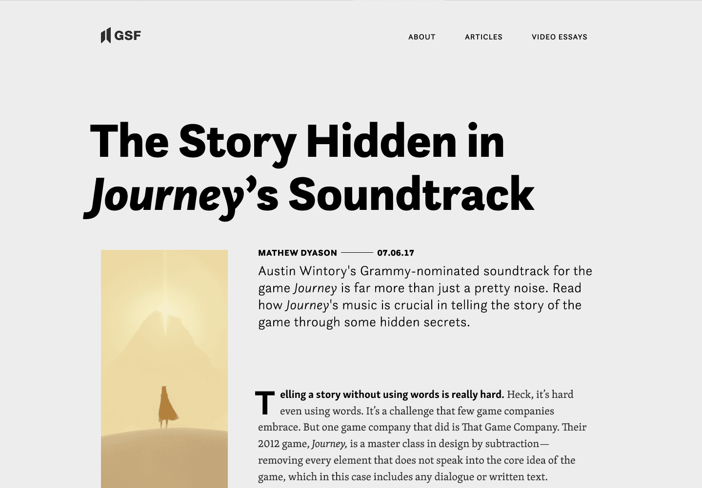
Layout Design for a Music Blog
This design was the result of some layout practice, based on Mathew Dyason/Game Score Fanfare's excellent video essay about the soundtrack of Journey.
Normally, if I were creating a CMS template for a client, I would have to consider how design decisions would apply to all blog posts. Here, though, I had the luxury of making decisions based solely on the content of this specific essay. For example, after trying a bunch of options, I ultimately set the title in Questa Sans because I got to use the font’s lovely, quirky lowercase “y”. And the italic too!
Likewise, a tall, narrow image may not work in all cases, but the opening shot in Journey is perfect for that aspect ratio.
Because this essay is about music, I paid special attention to the visual rhythm of the layout. There's variation in the spacing, for instance—look at the distance between the title and byline, compared to the distance between the abstract and the body copy.
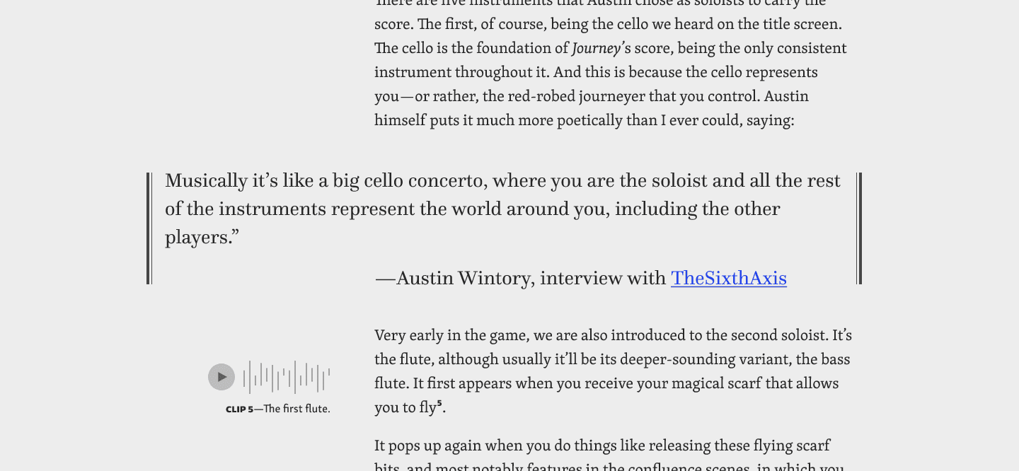
Here’s an example pullquote, inspired by musical notation, as well as an example of annotation and audio clips. Inserting audio would be critical to an essay like this; I like the idea of the relevant clip automatically playing when you click the annotation.
I used Skolar for the body copy because it’s a highly legible humanist font, plus it just feels so appropriate for an essay, doesn’t it? A pullquote calls for a font that shines at larger sizes, however, so I used Questa since I was already using its sans cousin.
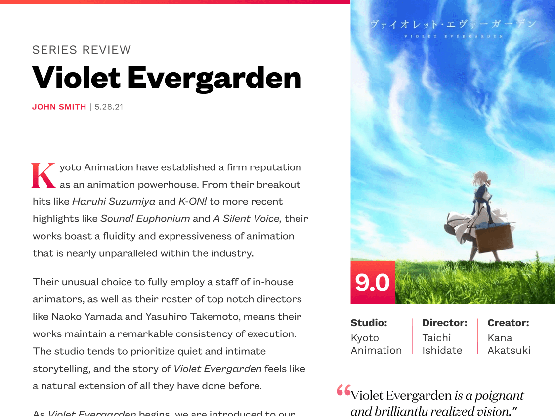
Layout Design for a Review Site
I wanted this design to feel bright and fresh, and to convey a mix of professionalism and quirkiness. For the title I picked Founders Grotesk because it walks that line beautifully. I love the little details like the curling tail on the lowercase “a”.
I didn't want to use Founders Grotesk for the body copy, though. I find that it tends to have some legibility issues at smaller sizes (e.g. “C” looks very similar to “O” because of Founders’ small apertures). The font family does come with a variation for small sizes but it loses some of the personality. So instead I added Work Sans, a wonderfully quirky but highly legible font. I love that it has small details that echo those found in Founders; this makes them a great pair.
For pullquotes and dropcops, I added Domaine. It’s from the same type designer as Founders, so they tend to pair well. Domaine is a calligraphic serif with small, spiky details that remind me of Japanese calligraphy—appropriate for an anime review site.
I incorporated a bright gradient for certain details that helps guide the eye around the layout. My favorite instance is the subtle gradient on the dropcap.
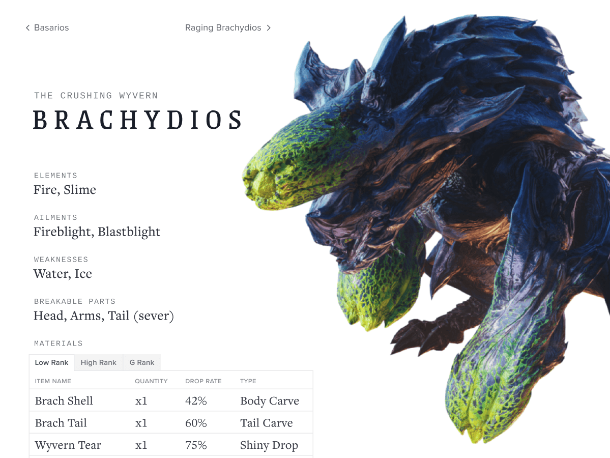
Typography Palette for a Game Database
For this sketch, games (specifically Monster Hunter) were my muse.
These games have always struck me as a clash of the ancient and the modern (you can fight dinosaurs with guns, for instance), so I wanted the design to reflect that. The monster name is set in Grenze, a chiseled Roman font that, when set in all caps and with generous tracking, conveys that old and epic feeling.
Cousine is a sans-serif monospaced font, a category that tends to convey modernity; you see tech companies use this type of font all the time. Here I used it for subheads, and it pairs surprisingly well with Grenze despite their very different personalities. That’s because, in this instance, they’re typeset with a couple of commonalities: 1) both all caps and 2) Grenze is set with loose tracking, which echoes Cousine’s monospacing.
After selecting the Grenze + Cousine pair, I added a couple of workhorse fonts for all the extra details: Freight Text for larger descriptive text, and Proxima Nova for small labels. This is intended to be a webpage with a lot of data, so I wanted a couple of clean, flexible fonts to make it easy for readers to parse all the information.