Case Study
TTRPG Rulebook Layout
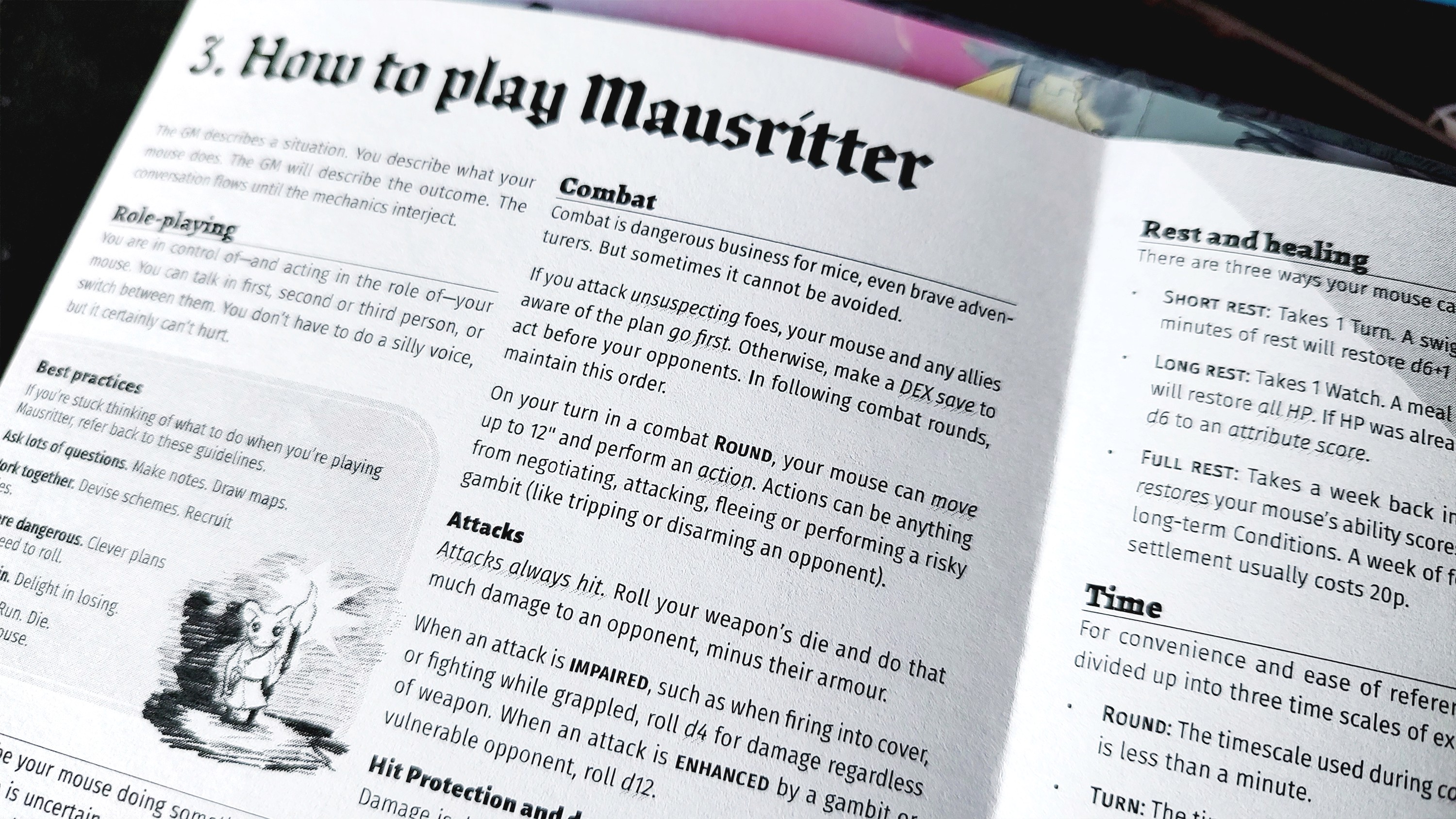
Lately I’ve been running Mausritter, an OSR-style TTRPG where the player characters are mice, for my family. But even though Mausritter is rules-light and I have experience with other TTRPGs, sometimes my sessions slow down because I have to fumble through the rulebook that I printed at home.
Layout Issues
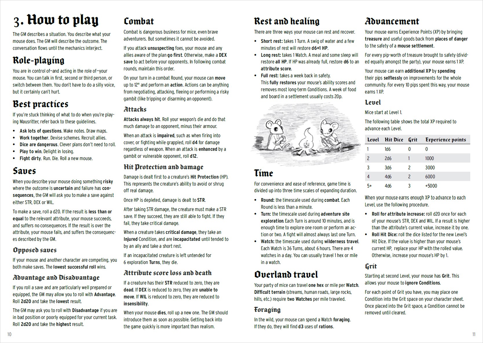
Below is the game’s original “How to play” spread. I always find my eye wandering all over the place and getting tired quickly.
Here are the main issues as I see it:
The Blackletter font is great for large headlines but less so for smaller subheads
The body font has some legibility and readability issues
Too much text is bold for emphasis, which makes none of it stand out
The layout is fairly flat with only a couple of elements breaking up the text
Design Constraints
To be fair, there are some constraints here because this rulebook is meant to be easy to print at home. So during my redesign I followed the same constraints:
The spread must remain at A4 size
The layout must be grayscale
The spread must contain all the same text as the original (i.e. no splitting the content into multiple spreads)
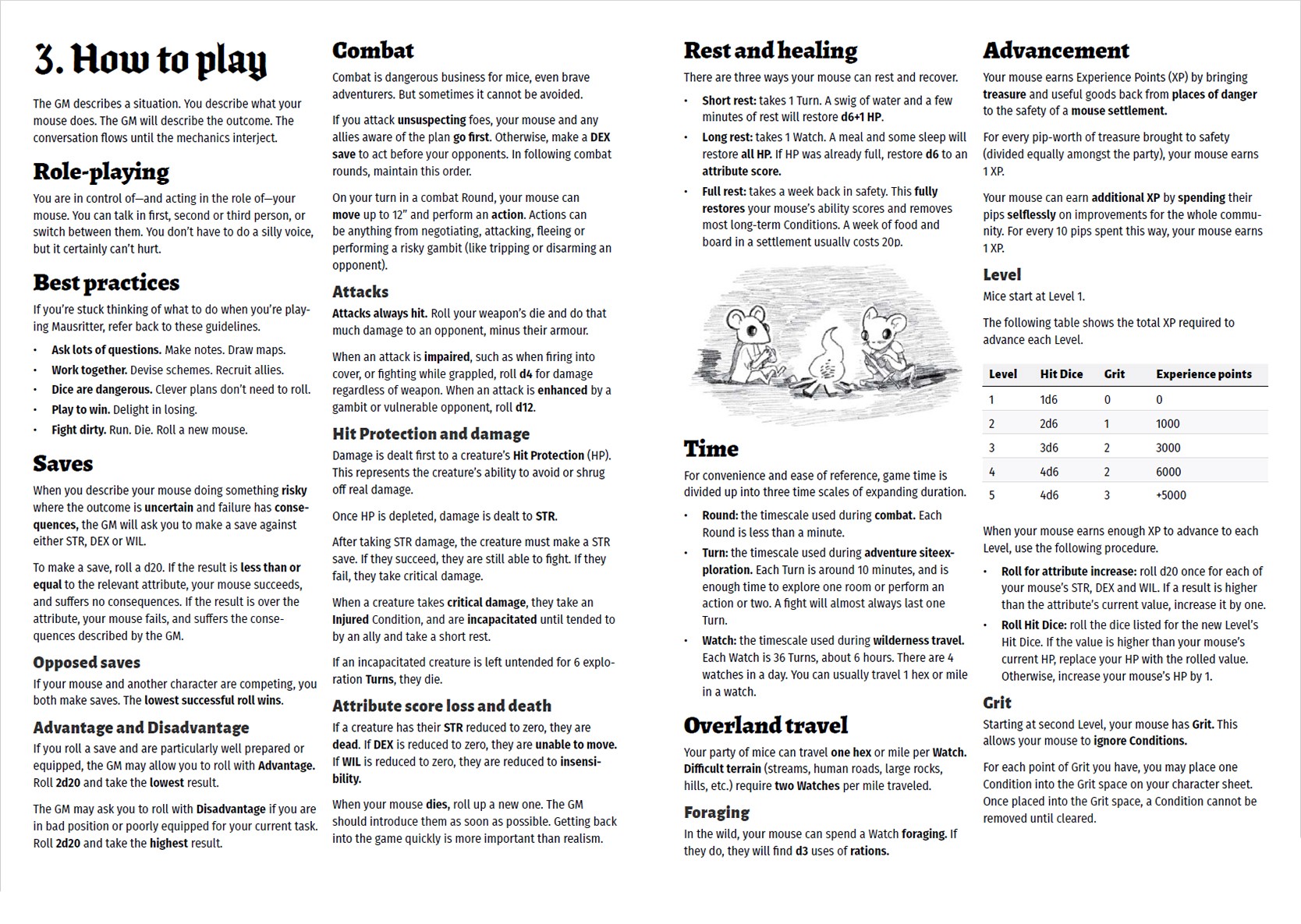
The first step was to update the font palette and define a new type system, which already went a long way with mitigating the issues.
Main Heading Font
Brokenscript Condensed Bold is the main font used throughout Mausritter’s branding, and I think it’s a great, recognizable choice. So I kept it for the main heading, “3. How to play,” where the large size prevents legibility issues.
There was still one problem: Brokenscript lacks Blackletter numerals! Easy enough fix: I just set the “3” in another Blackletter font I have in my library, which happens to have beautiful numerals.
Body Font
In the original layout, the body copy is set in Interstate Condensed. I think there’s a lot of merit to that choice; Interstate is, in most circumstances, a highly legible font, and the Condensed version conserves a lot of space. And despite being clean and mechanical, it has little quirks here and there that lend it a certain warmth. Tonally it’s a good match for this game.
That said, I think Interstate (especially the Condensed width) works best in short strings of all-caps text. Some of its quirks, like the sheared tail of the lowercase “g,” make the legibility suffer in small, longform text. And lastly, its “italics” are really obliques, which don’t look great. This limits my typesetting options, and I knew I’d need more flexibility later.
So instead, I switched to Fira Sans Condensed, a humanist font that works great at small sizes. It’s not quite as compressed as Interstate Condensed, and that makes it easier on the eye for longform text. I needed to set it at a slightly smaller size to compensate, but it’s so legible that this didn’t cause any problems.
Subhead Fonts
For the H2s I ultimately went with an old favorite, Alegreya. This font looks straight out of a fairytale book, but is much easier to read than Brokenscript. The two pair beautifully.
For H3s I went with Alegreya Sans. Naturally it pairs perfectly with Alegreya, and also allows for a smooth transition of sorts from the Blackletter heading, to the serif H2, to the sans serif body copy.
With the font palette set up and the type hierarchy more or less defined, I began finessing the typesetting and layout.
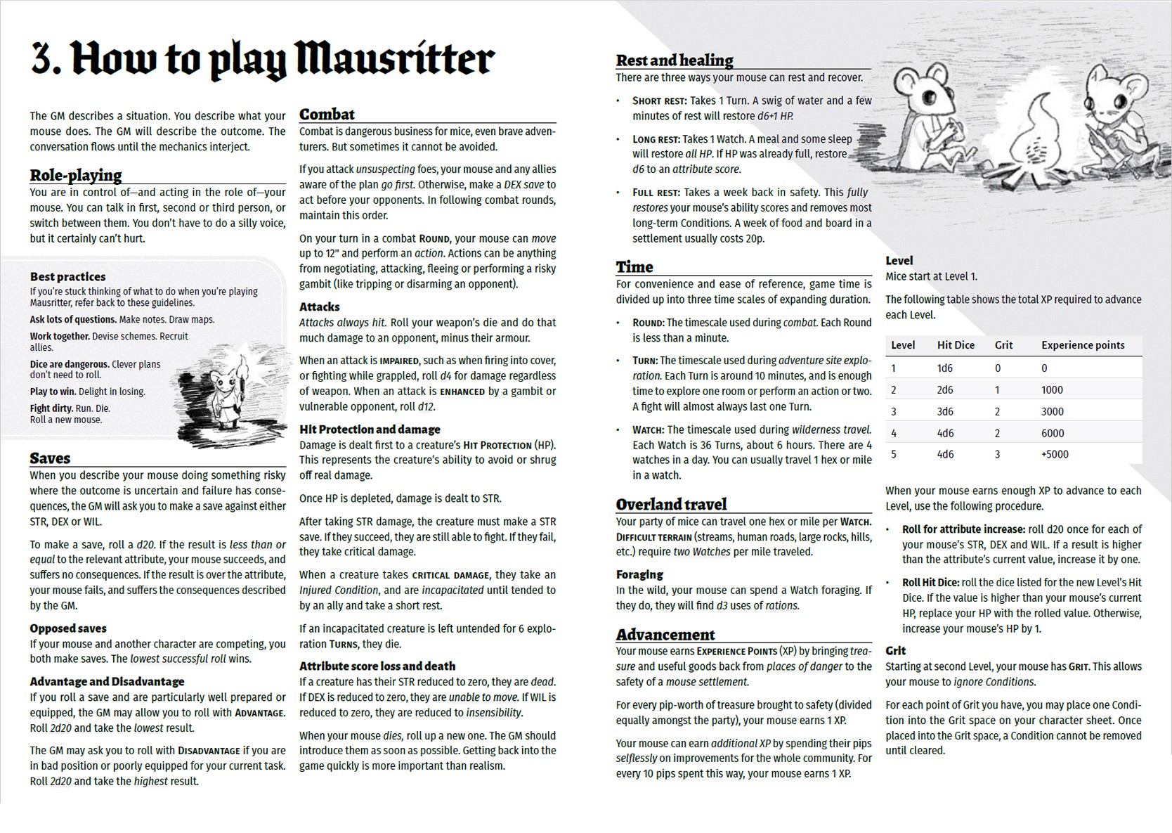
And here's the final layout!
Adding Depth & Hierarchy
Throughout the process I looked for ways to conserve space, like setting the H2s and H3s at a smaller size. Putting a rule underneath the H2s helps make the hierarchy clearer, and makes it much easier to determine at a glance where each section begins. This also allowed me to bump up the size of the main heading and let it stretch out across multiple columns. There’s nothing like setting a huge headline for a visual contrast, if you can get away with it!
I also looked for opportunities to add depth. The “Best practices” section is now a textbox that extends beyond the page, with one of Isaac Williams’ charming illustrations on the corner. It looks like the mouse adventurer is standing in front of the textbox, casting a shadow on it. The textbox itself also has a subtle noise texture, which I love.
The campfire illustration from the original layout is now scaled up and positioned to be more of a visual anchor. The gray block helps sell the lighting of the illustration, and layering it behind the text adds depth as well.
Balancing Skimmability and Readability
With longform text, I always try to make sure it’s easy for the reader to find the text they’re looking for without getting overwhelmed by the overall layout. It’s a fine line to walk; as I mentioned above, the original layout had too much bold text in the body copy, which drew my eye all over the place.
This was one of the trickier parts, but eventually I found a solution I liked. I came up with two styles:
For important terms that a new player likely doesn’t understand yet
For instructions on how to navigate those important terms
Important terms are set in small caps and a slightly heavier weight; they stand out but they don’t demand your attention. Instructions are set in italics (that’s why we needed a font with true italics!) with a row of light diagonal lines underneath. Initially I tried a simple underline, but they looked too much like hyperlinks.
Now, if readers are skimming for a certain rule or term, it’s easy to find and figure out what to do, and the layout doesn’t look overwhelming.