Case Study
PDF Template Redesign
When I started my role at Fireminds, one of my first tasks was to update the company’s PDF template, which was used for brochures and whitepapers.
Project Goals
The first thing I did was establish two goals for the project:
Good reader experience
Template flexibility
Any longform content should be not just easy to read, but pleasant to read. In this case, it would’ve been a shame if the reader opened the brochure and immediately left because the content looked too dense and intimidating. We want them to reach the call to action every time.
Furthermore, Fireminds’ sister companies also used the template, but switched in their own brand colors and fonts, so I wanted it to be quick and easy to use the template without a lot of back-and-forth. I also wanted to ensure the template looked great with each sister company’s brand identity.
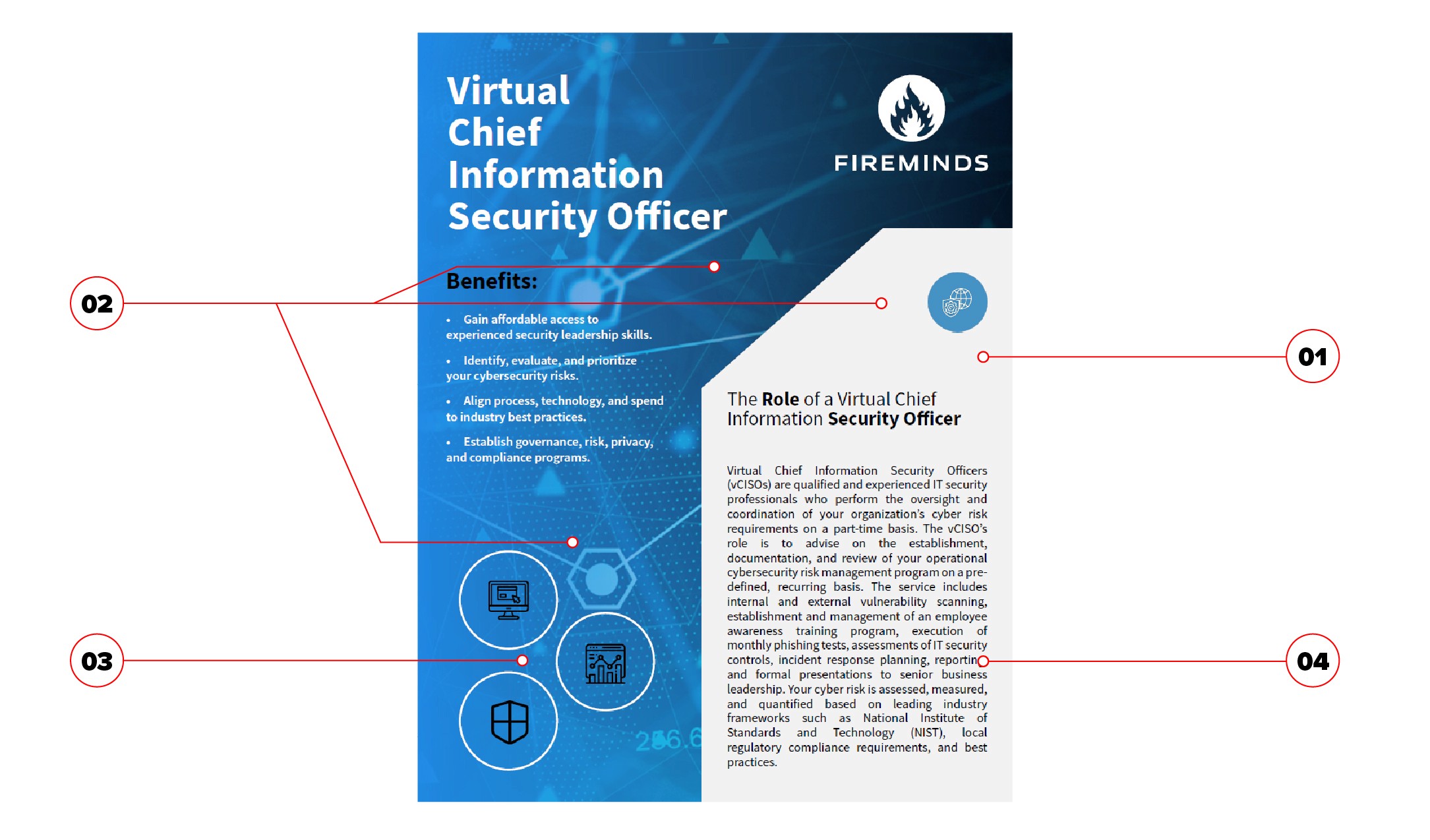
Below is what the original template looked like.
Visual Breakdown & Analysis
Immediately, there were a few problems counterproductive to the two goals.
In terms of visual interest, this is dialed up to 11. That’s good for some things, but for longform reading like this, it makes it hard for the reader to focus on what we want them to focus on: the content.
In fact, the reader’s eye is pulled away from the bulk of the content because of how much weight the background image has.
Let’s break down the issues:
The gray block is an interesting shape, but creates awkward spaces for long blocks of text
If content length doesn’t fall within a very specific range, we end up with inactive negative space, which creates shapes that we may not see but we do feel
It makes us want to fill up that space with icons, so we’re putting pictures on top of pictures, which contributes to the visual noise
With this template, we have to be very careful with the content so that it fits. We may have to cut content that’s too long, or inconsistently scale content that’s too short, for example
In other words, the design is informing the content. But the content is more important, so this should be the other way around.
In addition, the gradient on the background image didn’t work with each sister company’s brand colors. For example, one had a vibrant orange as their primary brand color, which turned brown in this design; not likely what they wanted.

Context Informs Design
I started the revamped template design with a simple change: I turned the page on its side.
The reason is very simple as well: most of the time, people read these on screens. Landscape orientation is closer to a monitor’s dimensions than portrait orientation. This means you can see more of the page at one time without having to choose between scrolling till you have carpal tunnel or zooming out till you have to squint to read the text.
It also lets us fit more content on the page itself. And as a bonus, whenever we needed to print, it wouldn’t cost anything extra because we were still using US letter paper.
Building the New Skeleton
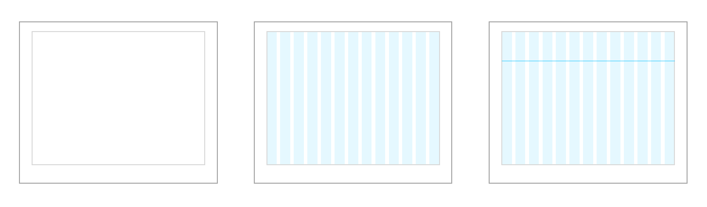
Now let’s return to the goal of a flexible template. Instead of establishing a laundry list of rules and hoping future designers would follow them, I created a modular grid.
First we add generous margins, which will contain the bulk of our content. Note that the bottom margin is larger; this makes the content feel lighter, like it’s floating toward the top of the page.
Next, add some columns to create structure.
For page 1, I also added a hangline to indicate how far down the page content should begin.
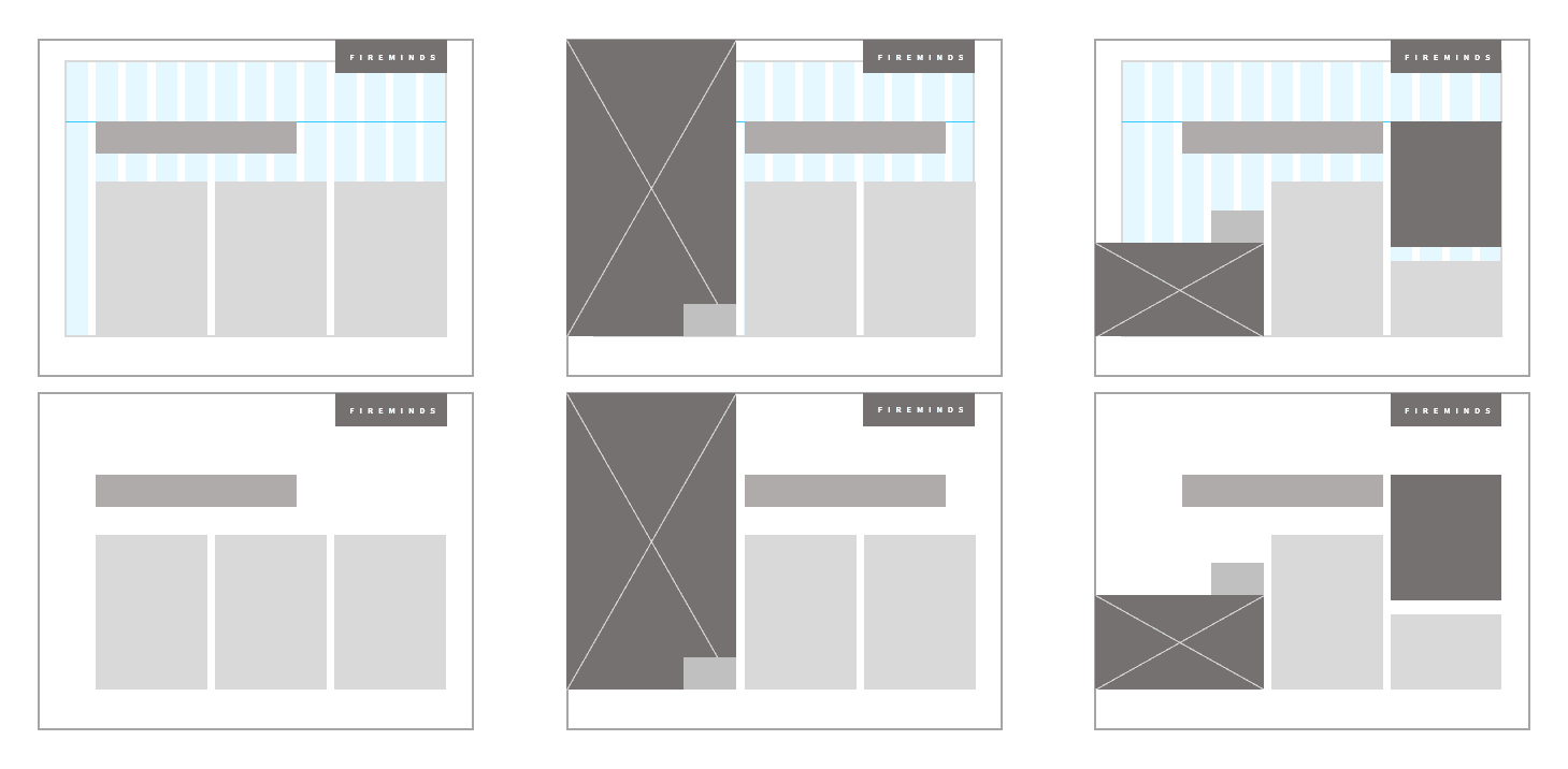
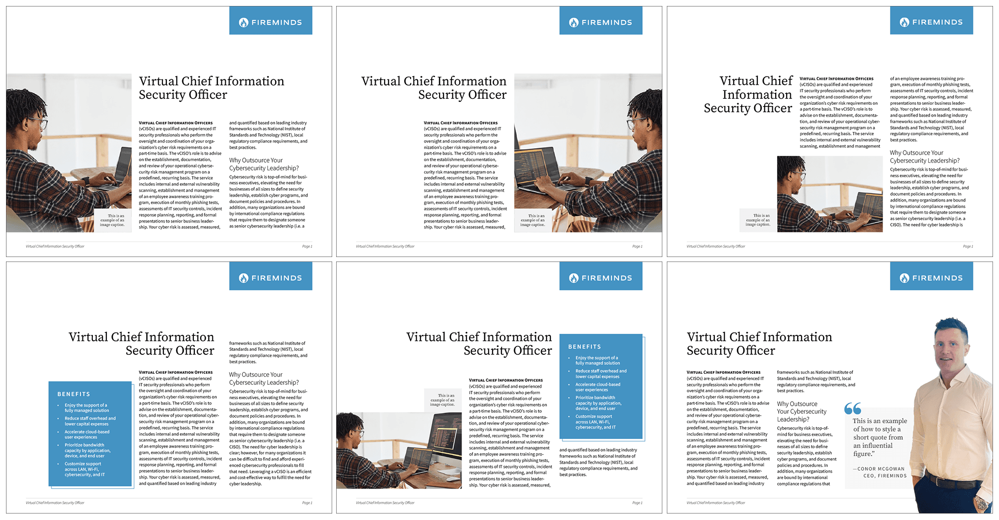
This underlying skeleton helped visually tie all the company’s PDFs together, and it allowed for a variety of layouts depending on the needs of the content.
A Richer Font Palette
During this process, I felt it would be beneficial to add one more font to the palette. Before, the company was using Source Sans for everything.
And I love Source Sans! It’s great at what it was designed for: utility. But for headlines, it’s a little lacking in flavor.
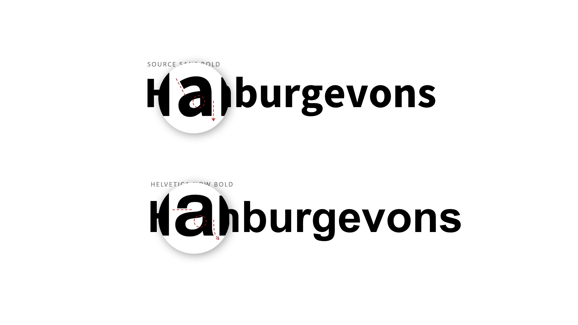
Let’s compare to Helvetica, another neutral font. There are a bunch of little details that Helvetica incorporates but Source Sans smooths out.
Compare the lowercase “a,” for example. Its tail curls slightly in Helvetica, and the curves of the bowl are smoother. Not so in Source Sans. There’s also right angles all over the place in Helvetica, whereas Source Sans keeps letters more open.
All these details add up to give Helvetica an elegance that makes it a beautiful font at large sizes, whereas Source Sans prioritizes readability at small sizes.
Lucky for us, Source Sans has a companion font with that little bit of extra flavor we’re looking for: Source Serif.
Source Serif added a little bit of humanity and warmth to the font palette. I felt this was an important quality since the company provided professional services—our customers directly interacted with us a lot.
Many tech companies go for a look and feel that’s quite cold and mechanical, so this helped our marketing materials stand out from the crowd.
Letting the Content Dictate Layout
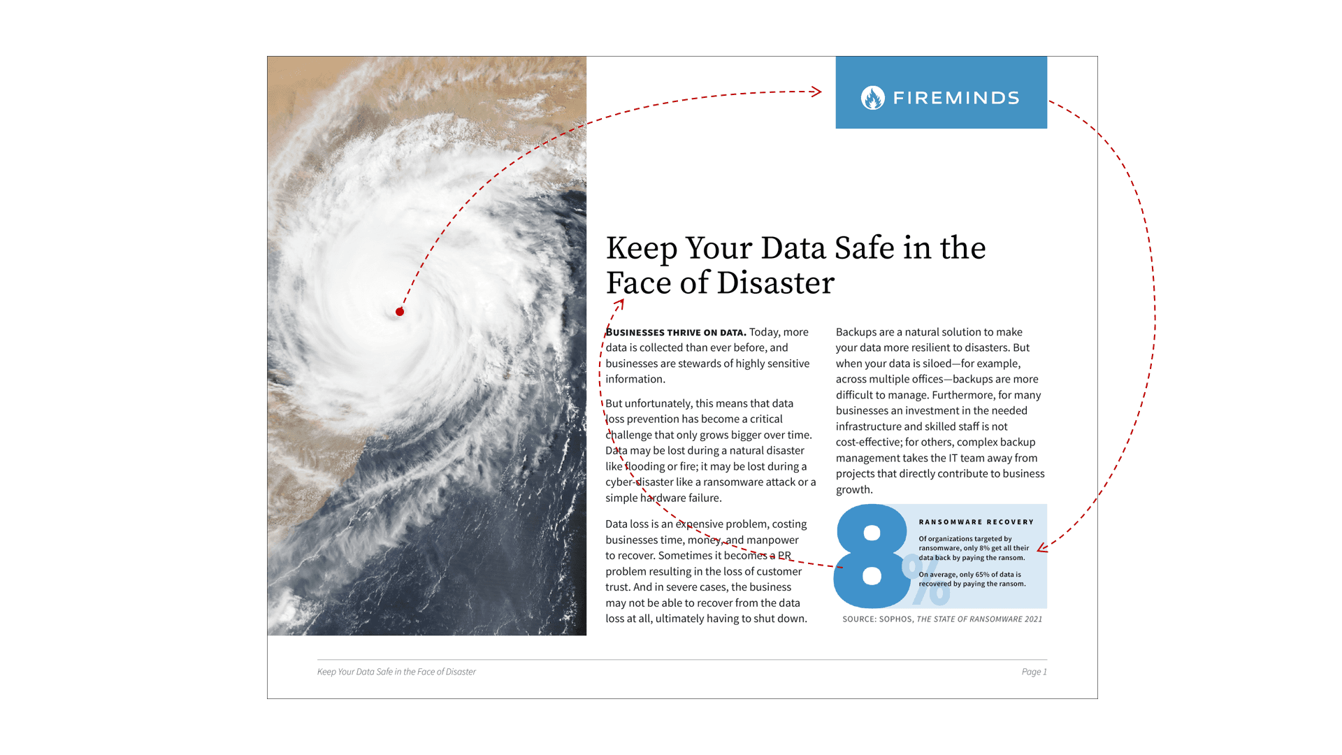
Above is a brochure I wrote with the product team. Even with different content, it still looks cohesive with the other layouts. And there’s a couple of other things I like about this.
First, it encourages the reader’s eye to flow through the page in a pleasing, non-distracting way. Most likely, they’ll focus on the image first—in this case, right in the eye of the storm, I’d bet—and then go to the next element with a lot of weight, which is the logo.
The logo is connected to the chart by alignment, size, and color, so they’ll probably look at that next. And finally, they’ll gravitate to the headline and begin reading the article.
It’s also quick and easy to rebrand the template. Before, orange was a difficult color to work with because of overlaying gradients, but here the PDF will still look great.
Letting Content Breathe with Negative Space
With this brochure, I really leaned into the negative space. This acts as visual quiet that allows the reader to focus on the actual content. It also projects confidence because we’re not trying to dress up our message with needless decoration.
Furthermore, none of the negative space here is trapped, so it doesn’t create unwanted shapes. We could even create more negative space by making the photo smaller, but this topic allowed for a striking image, so I chose to leverage that.